Pepperdine Integrated Brand Campaign
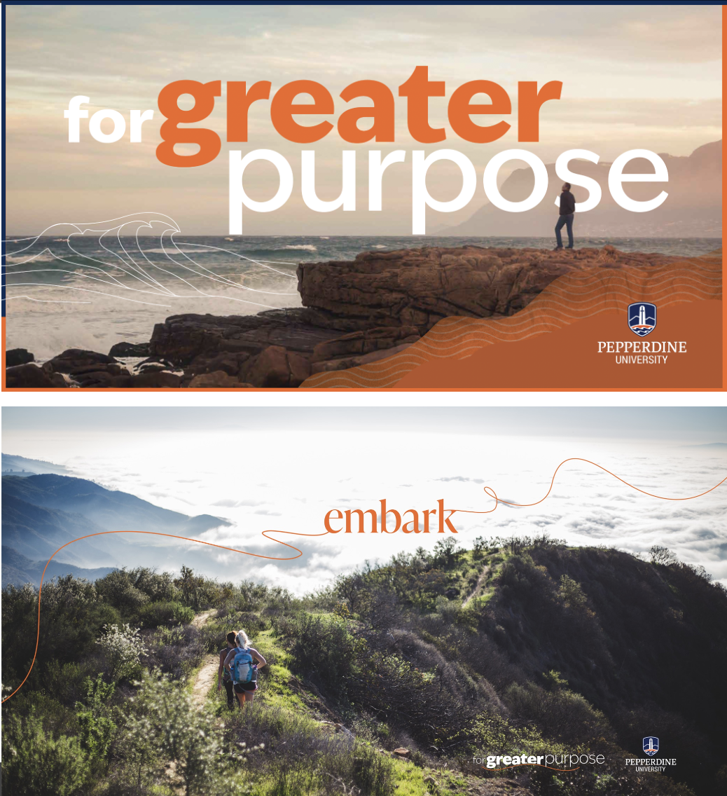
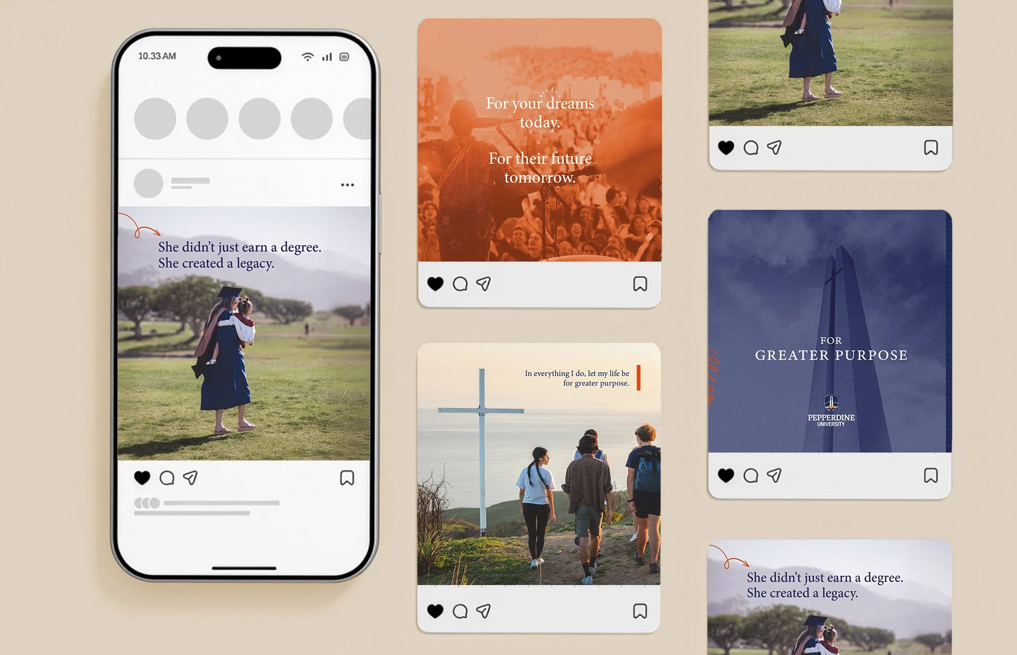
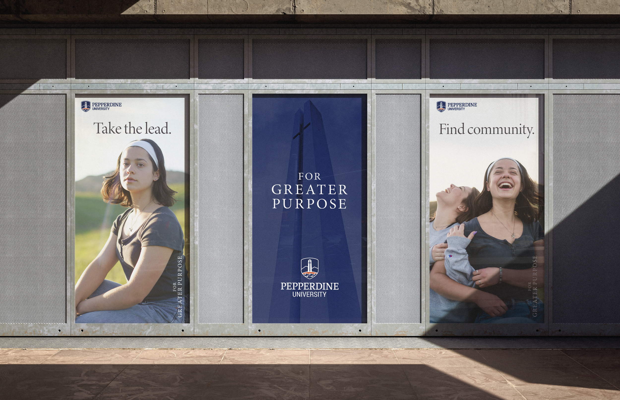
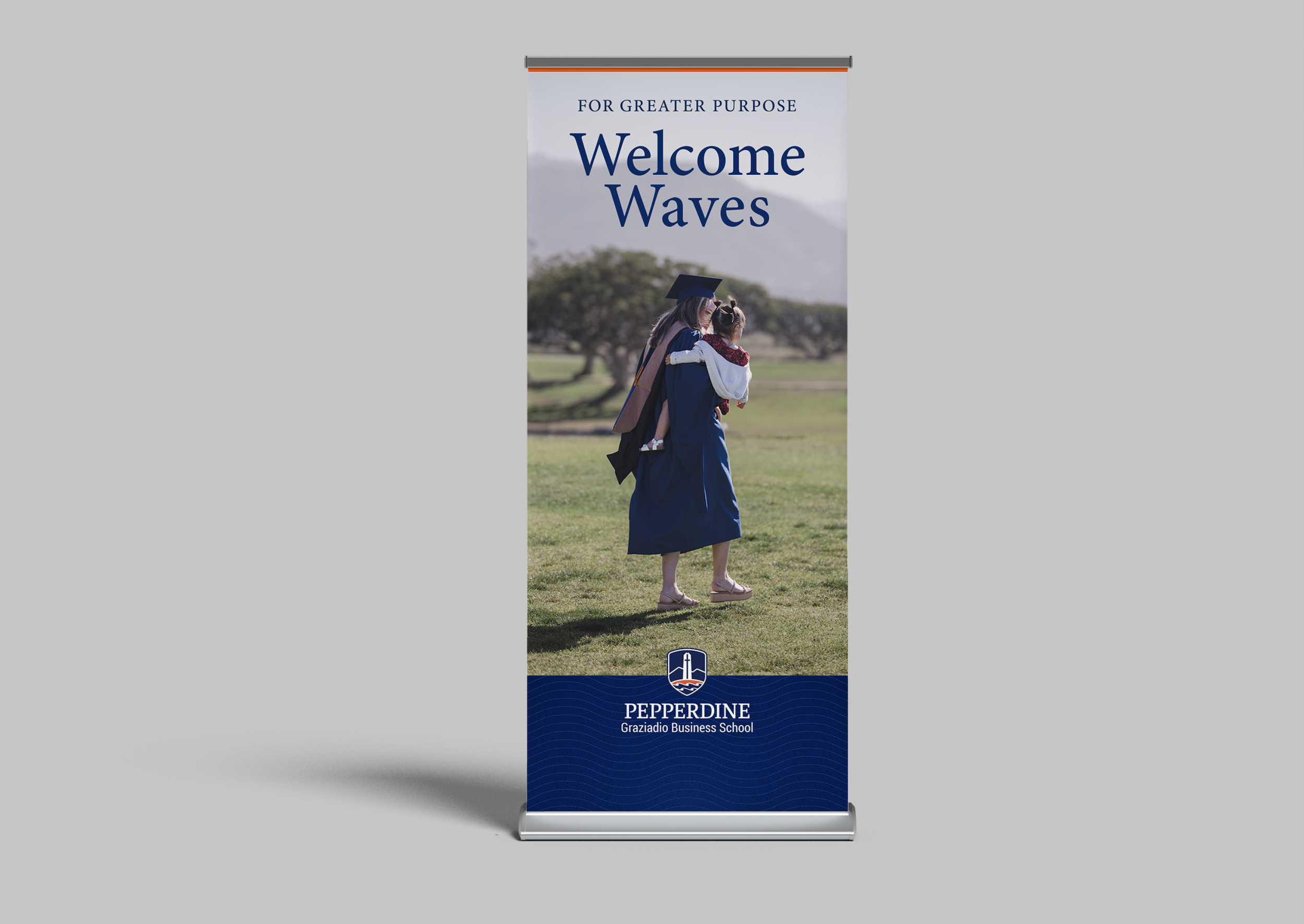
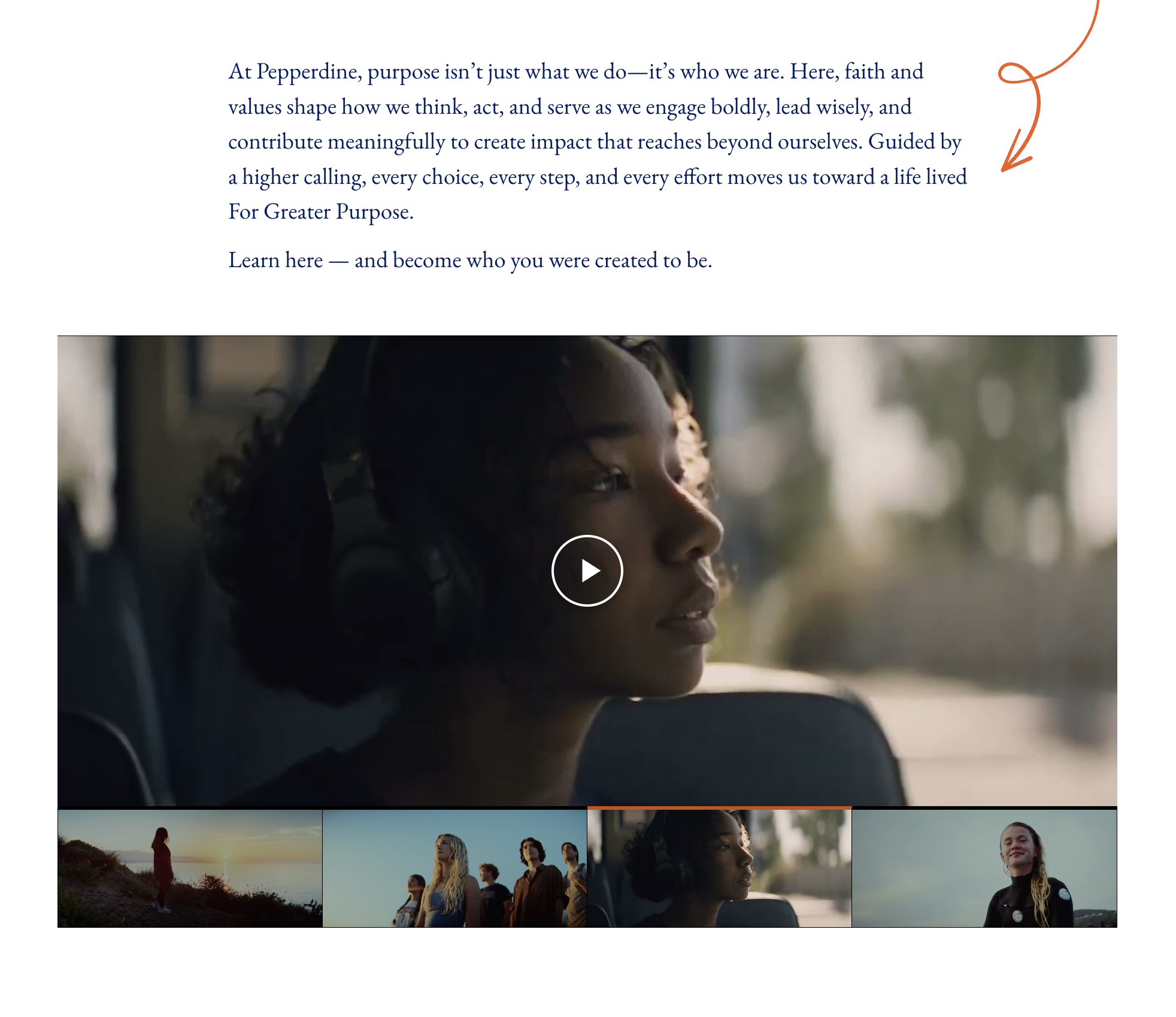
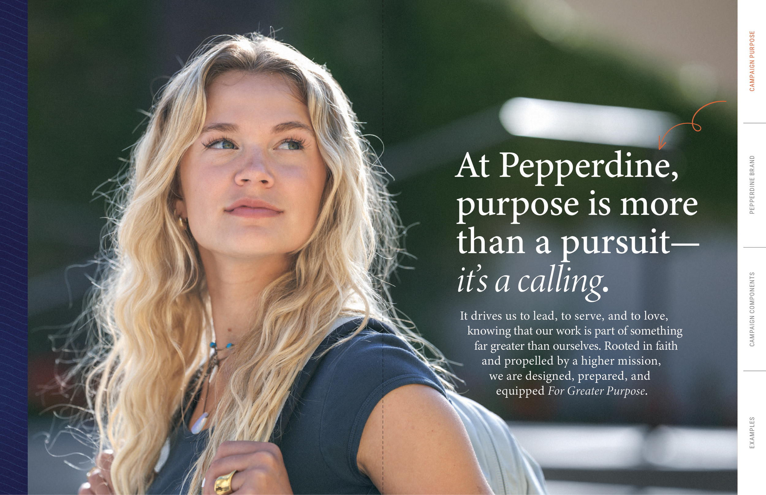
For Greater Purpose

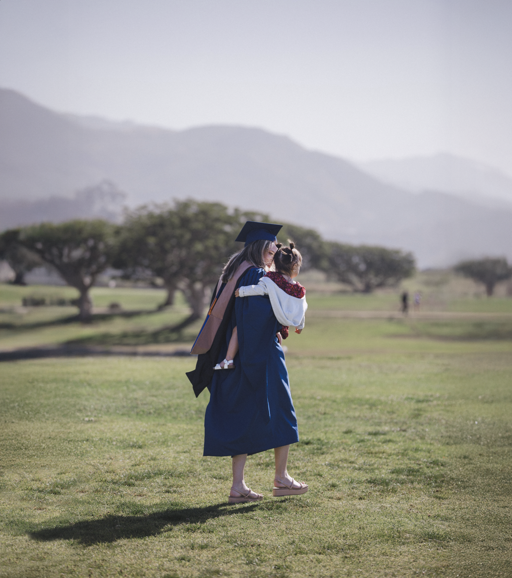

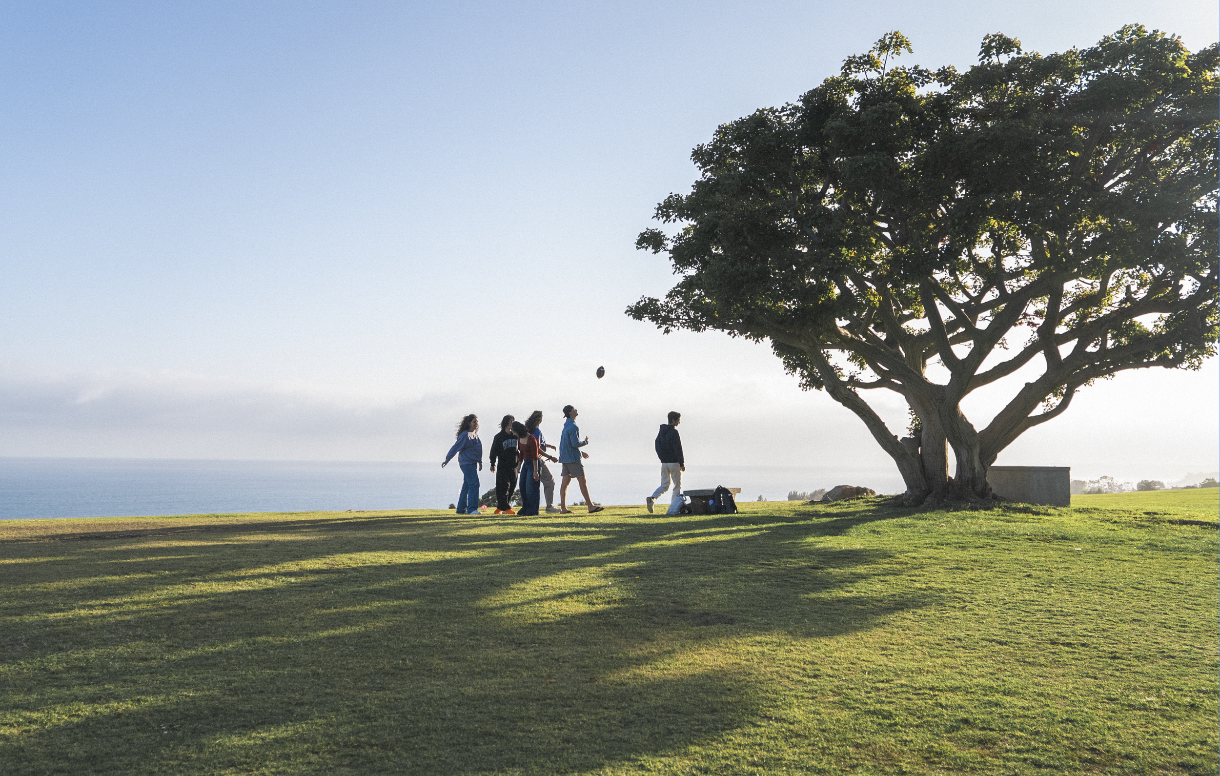
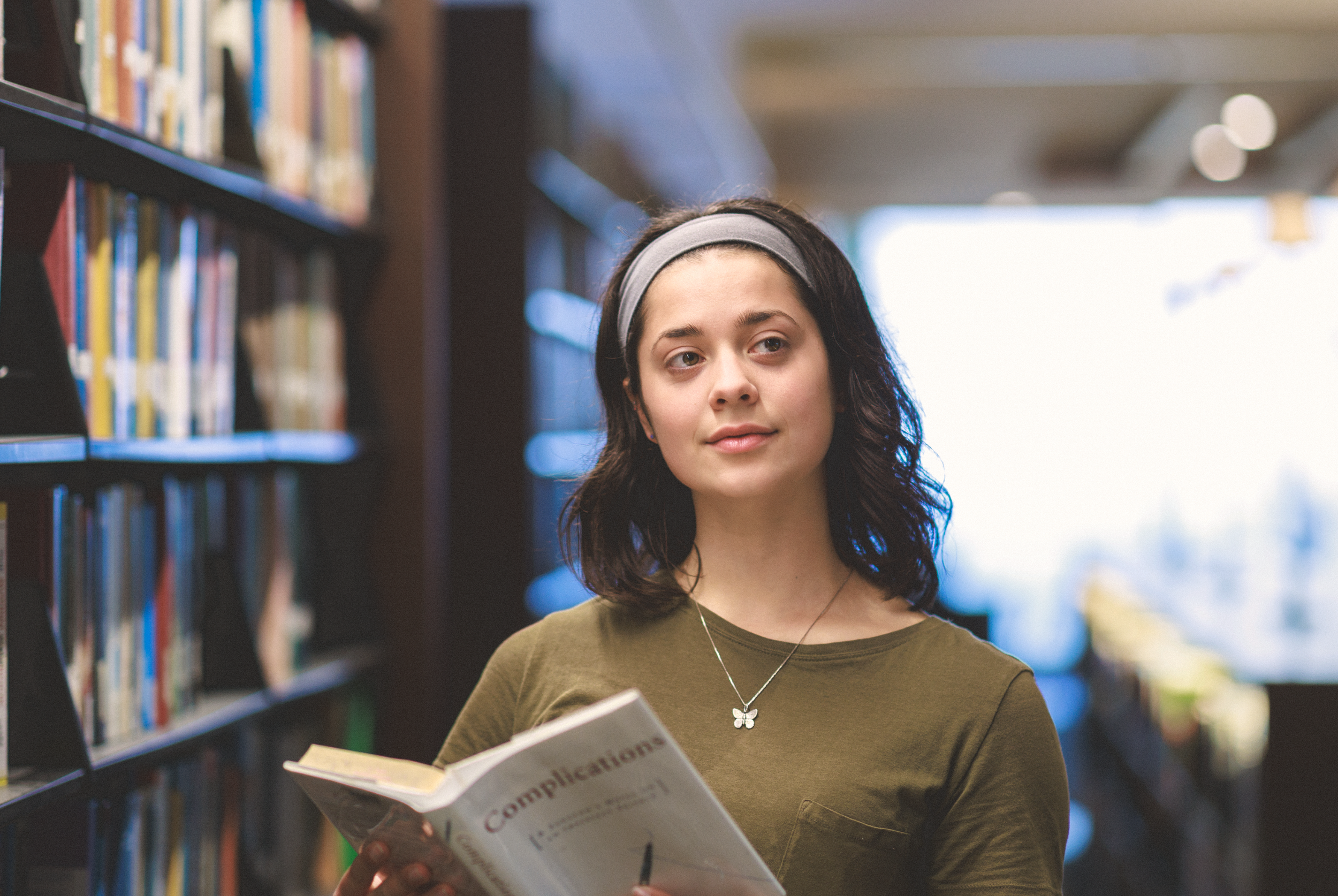
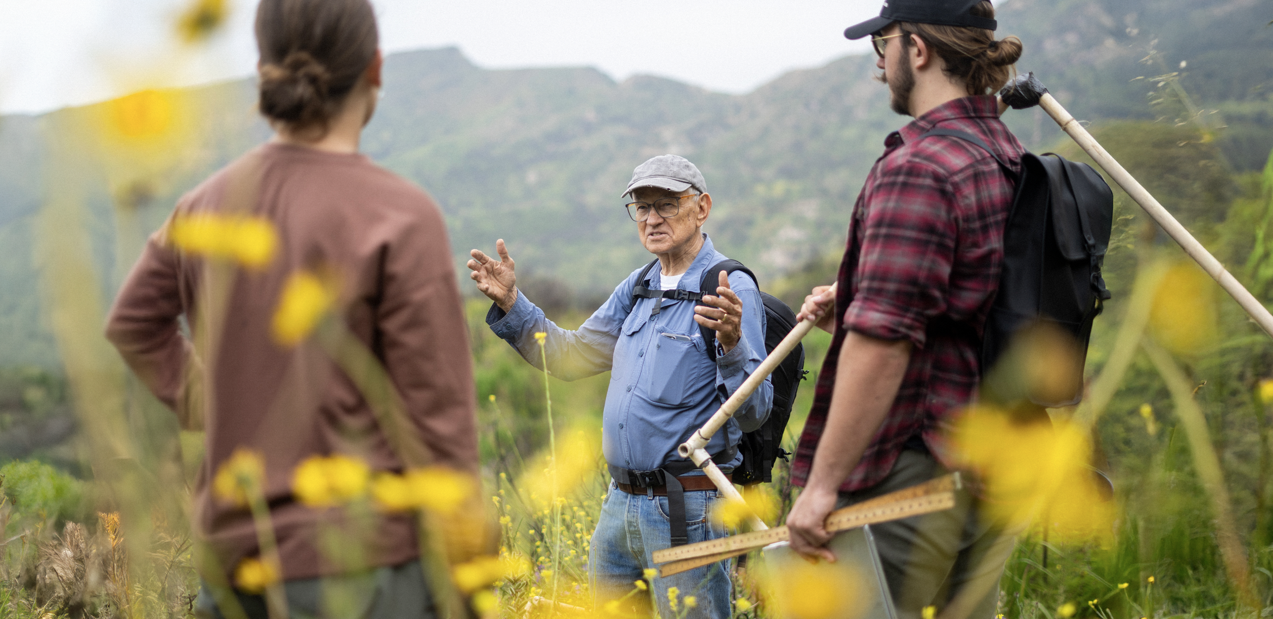
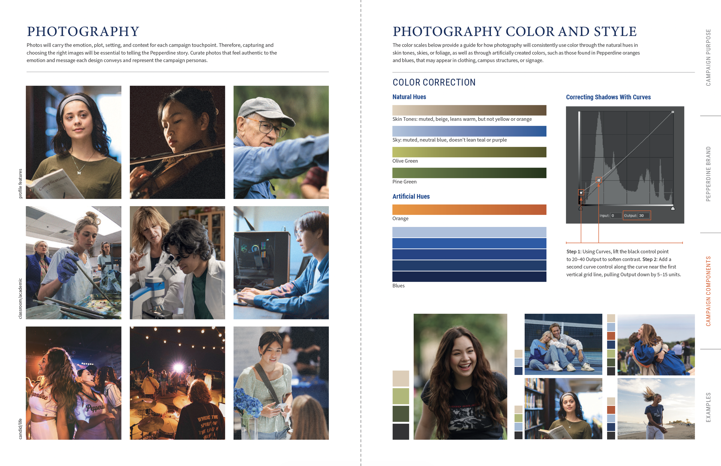
Photographer credit Pepperdine University (Grant Dillion, Sarah Dillion, Alex Nagode, Cecily Breeding, Allen Haren)


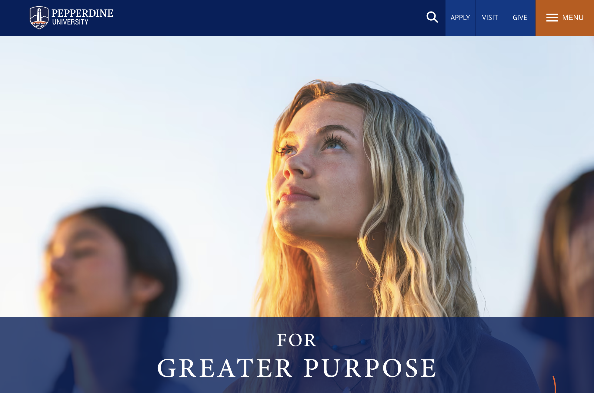
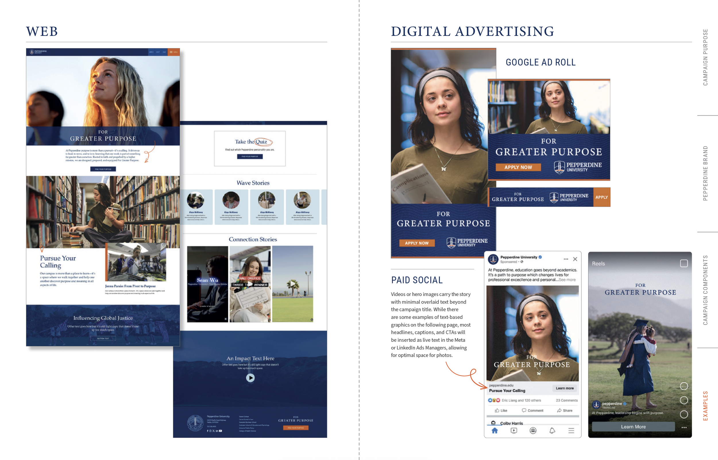
Landing with purpose
Mockups served as the framework for building the campaign landing page, providing button styles, color usage, type systems, hierarchy, special content blocks, and content structure.

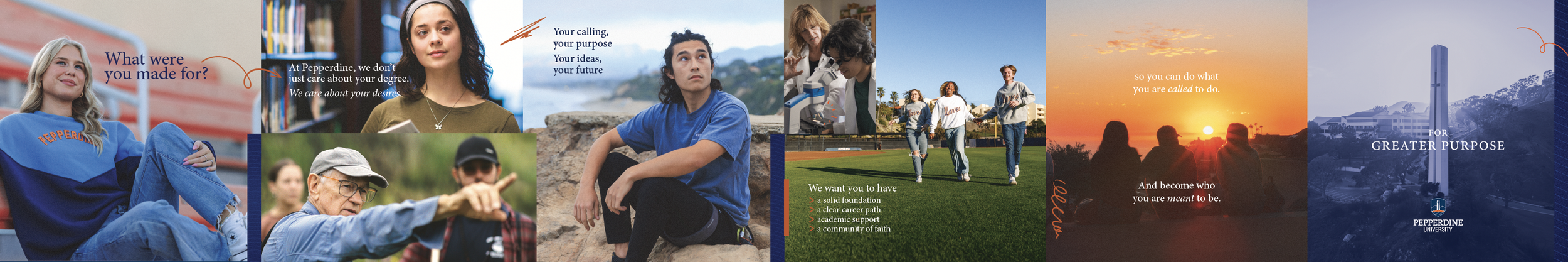
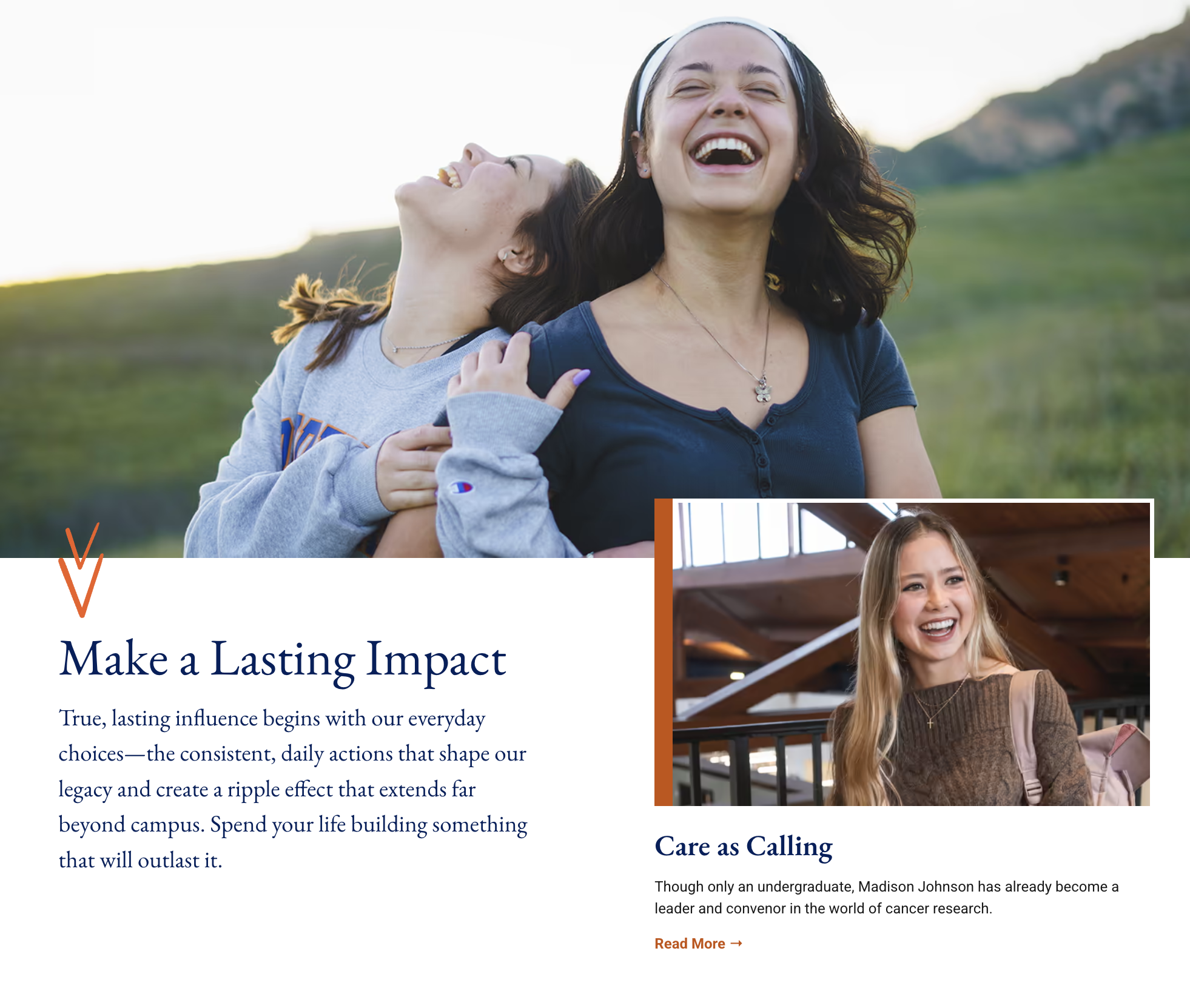
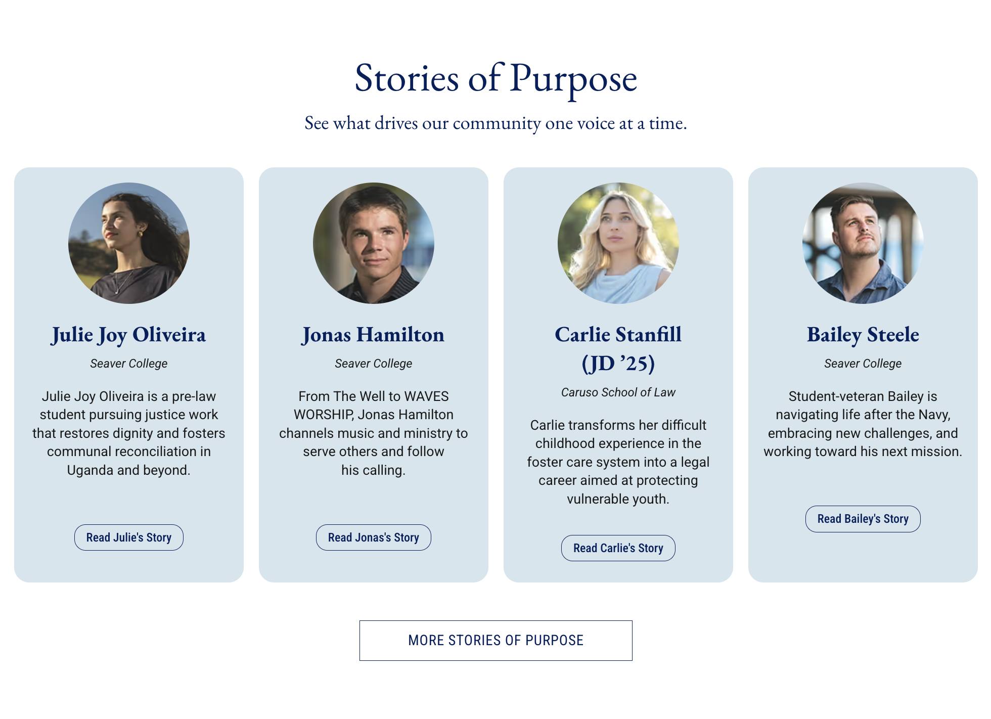
I set the page hierarchy to emphasize three primary content sections for each of Pepperdine’s brand pillars and instructed the developers to place special callouts or unique content on a blue image background or brand texture. With photography and video as the primary narrative drivers for the entire campaign, the web design called for photo and video blocks that dominated the page.

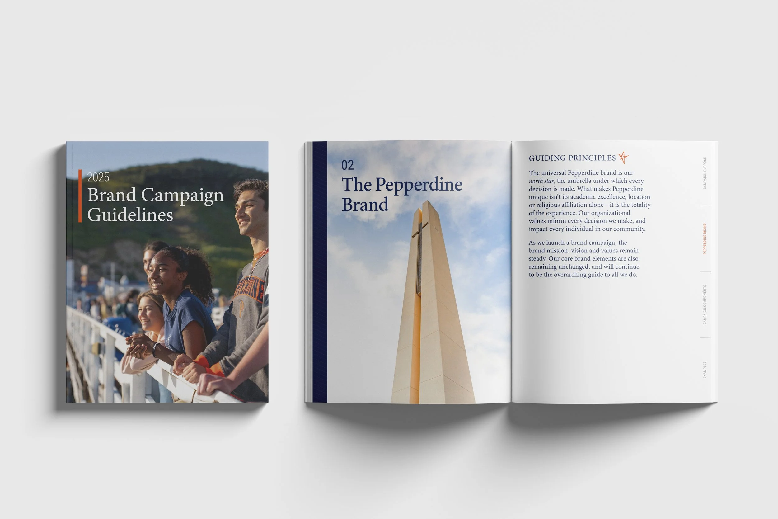
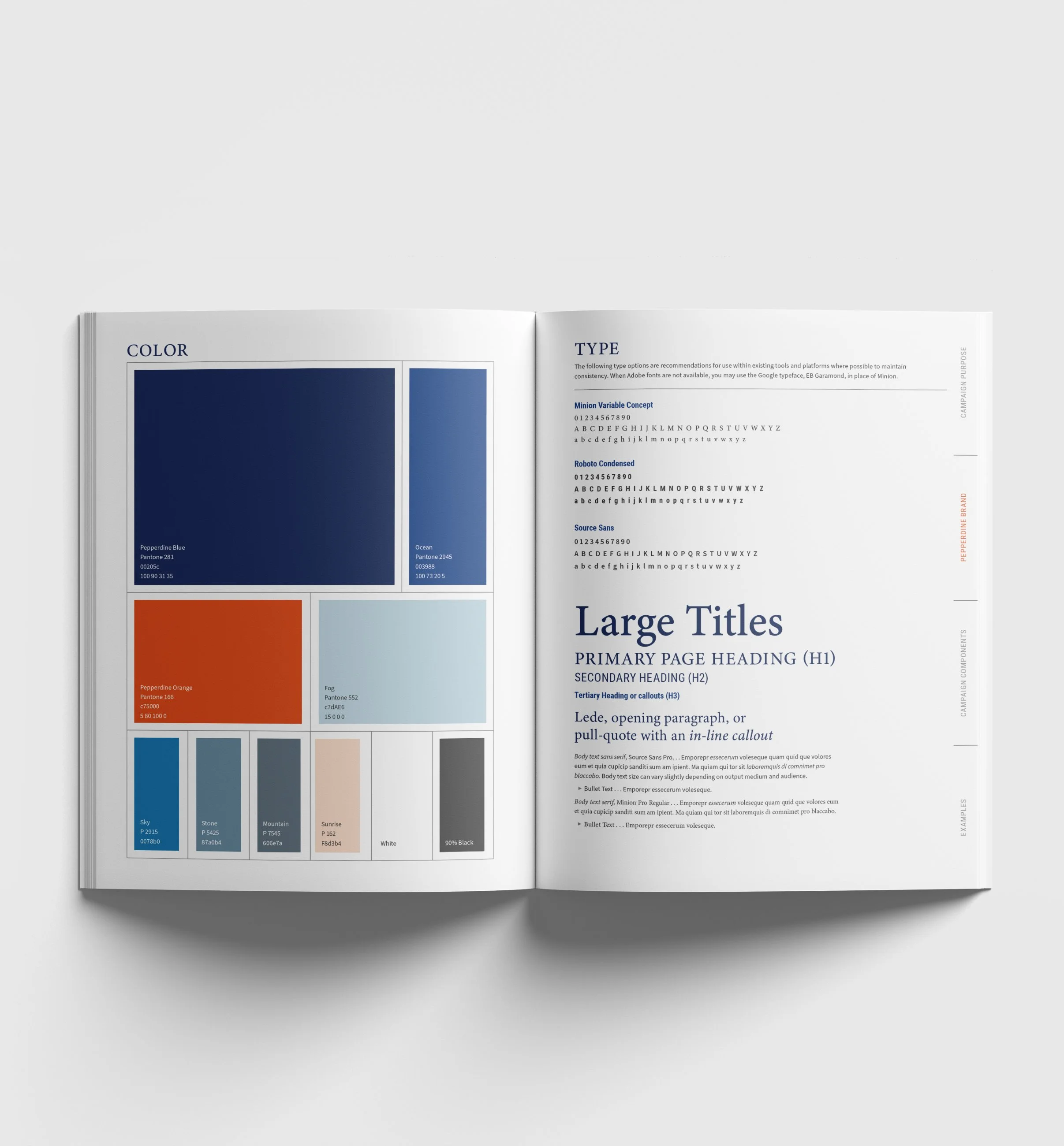
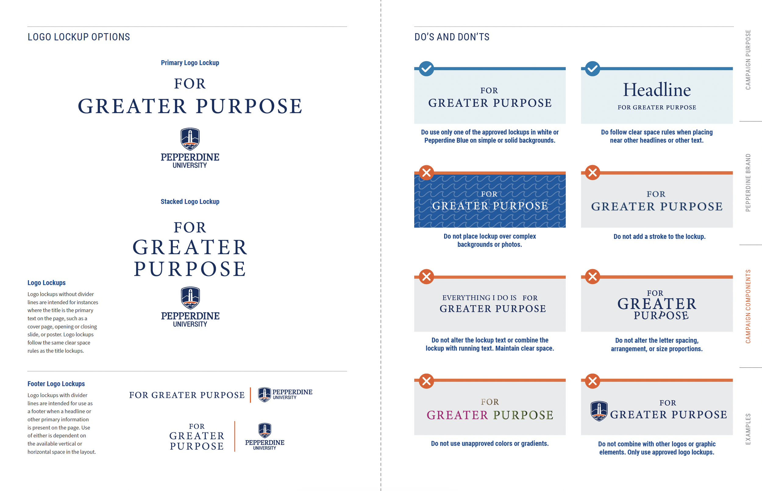
Brand Guide
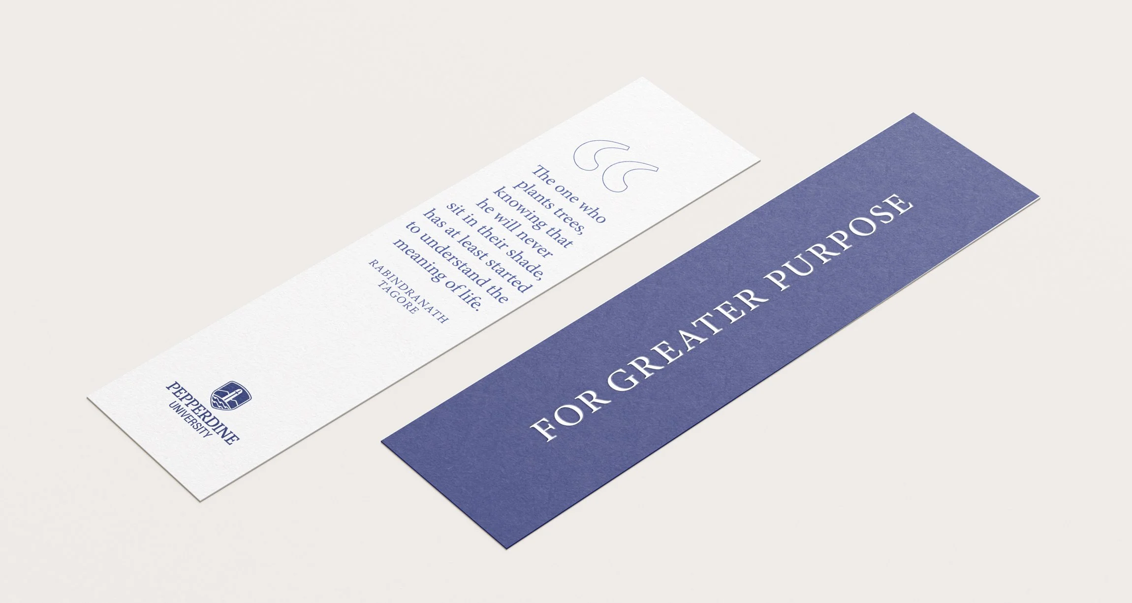
Message, tone, values, type, color, texture, and imagery converge to form an identity that digs much deeper than a logo or a single ad. The guide captures the way students and community members should feel and experience the Pepperdine brand. Implementing requires consistent contributions from leaders across the University. The brand guide provides clear boundaries and instructions on what elements can be applied and how.
At each stage, I worked collaboratively with stakeholders to improve adoption and integration of the campaign across various teams.
-
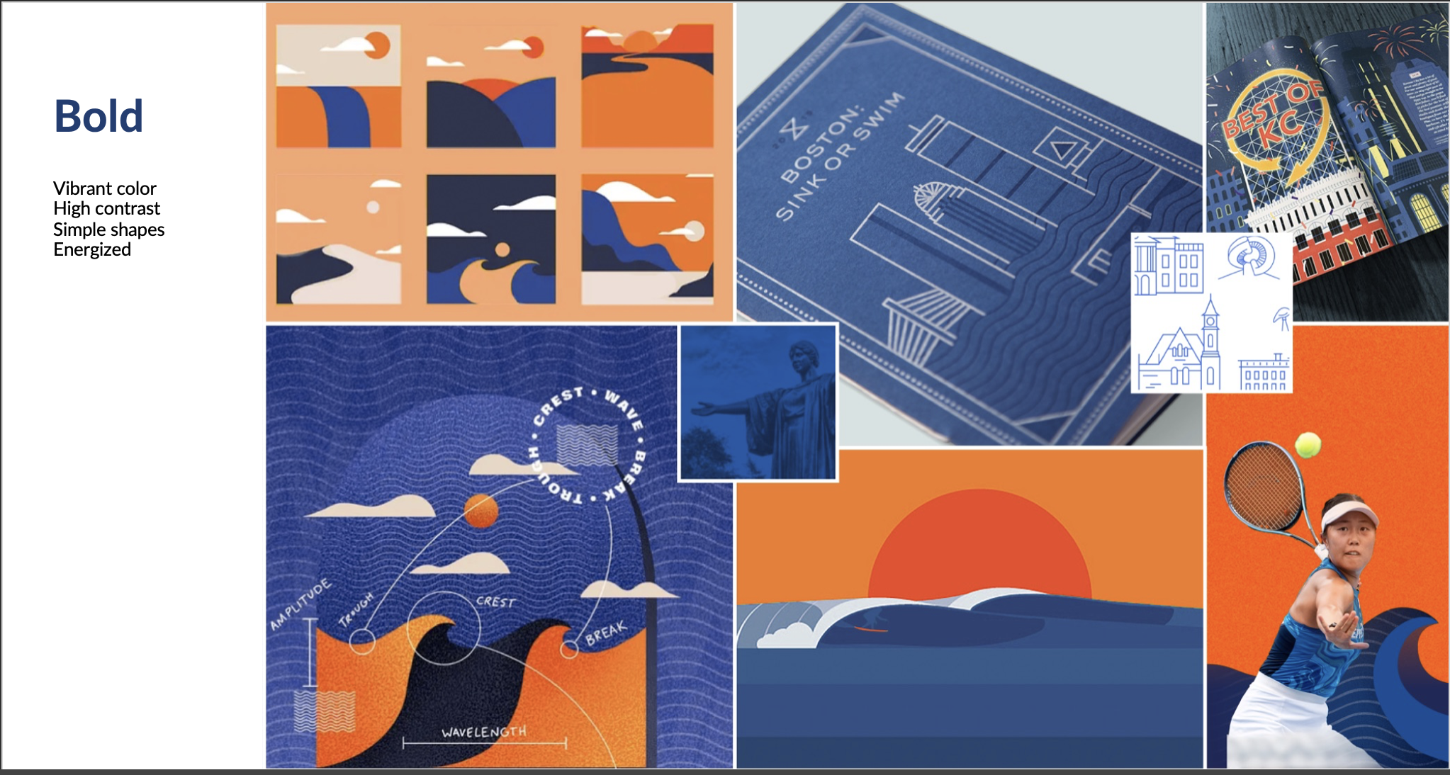
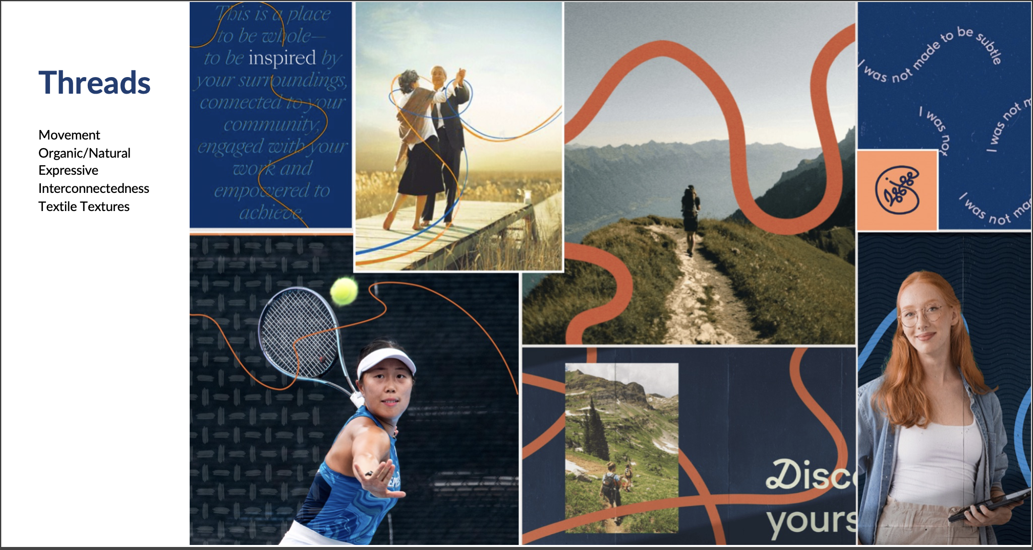
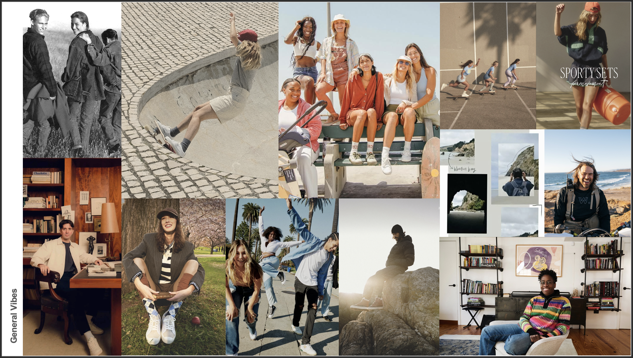
During the early phase, I created and presented several pitch decks that explored multiple design aesthetics for executive stakeholders. When the stakeholders couldn’t articulate their preferences, I created a this-or-that interactive deck featuring adjectives, type styles, and advertising samples, turning subjective opinions into objective, practical design strategies that helped solidify the design goals and direction.
-
Each week, I led a design meeting with the client, sharing multiple drafts of key concepts and pairing the title lockup, found images, and placeholder headlines or text to establish the look for the photography. After about 3 weeks, we were able to lock in the art direction for the first photoshoot. I provided style sheets and inspiration for photographers and media producers to ensure consistency. I leveraged the incoming photography to finalize the interplay between type, textures, and accents, ensuring a cohesive visual language for the brand guide.
-
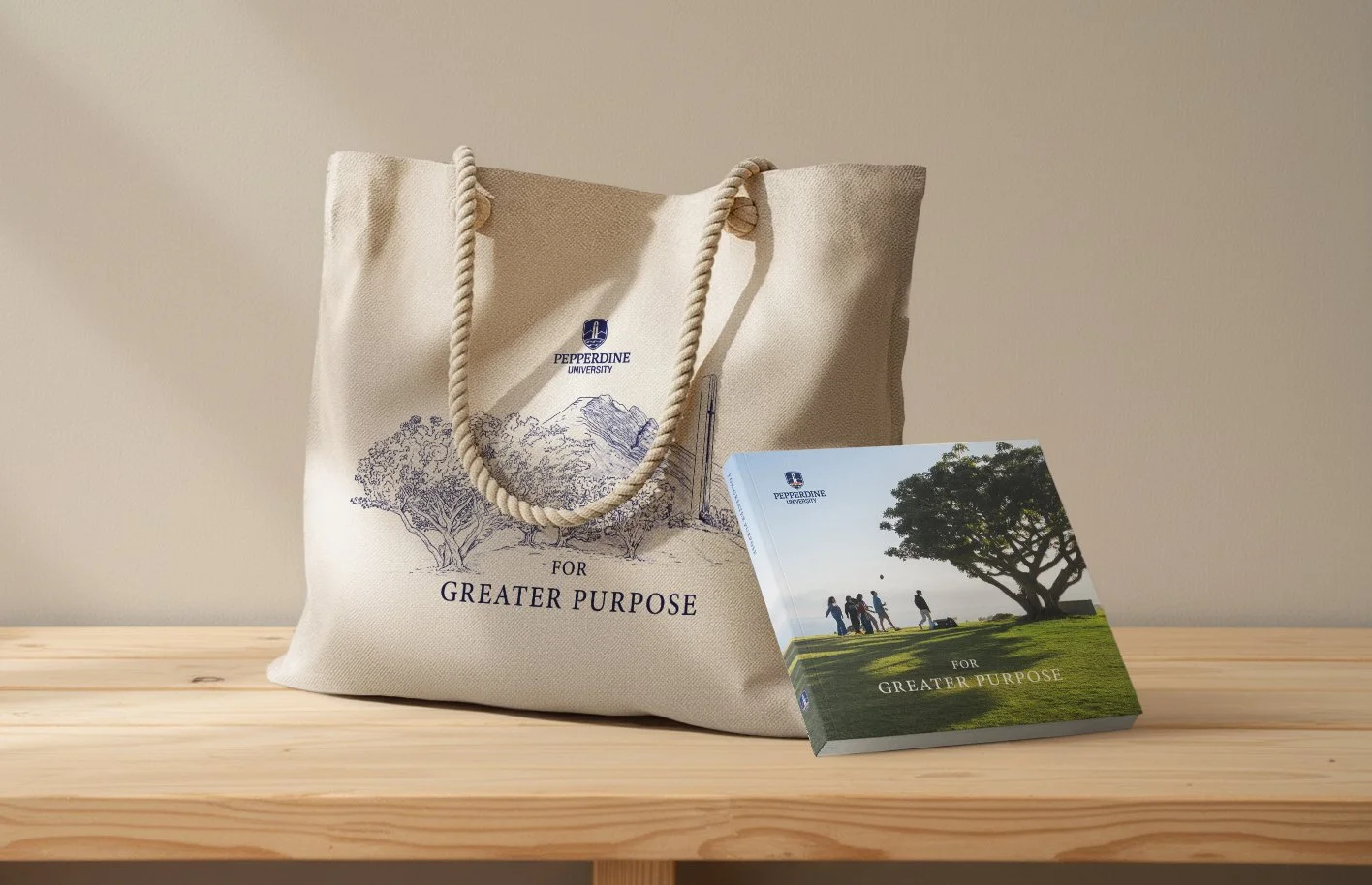
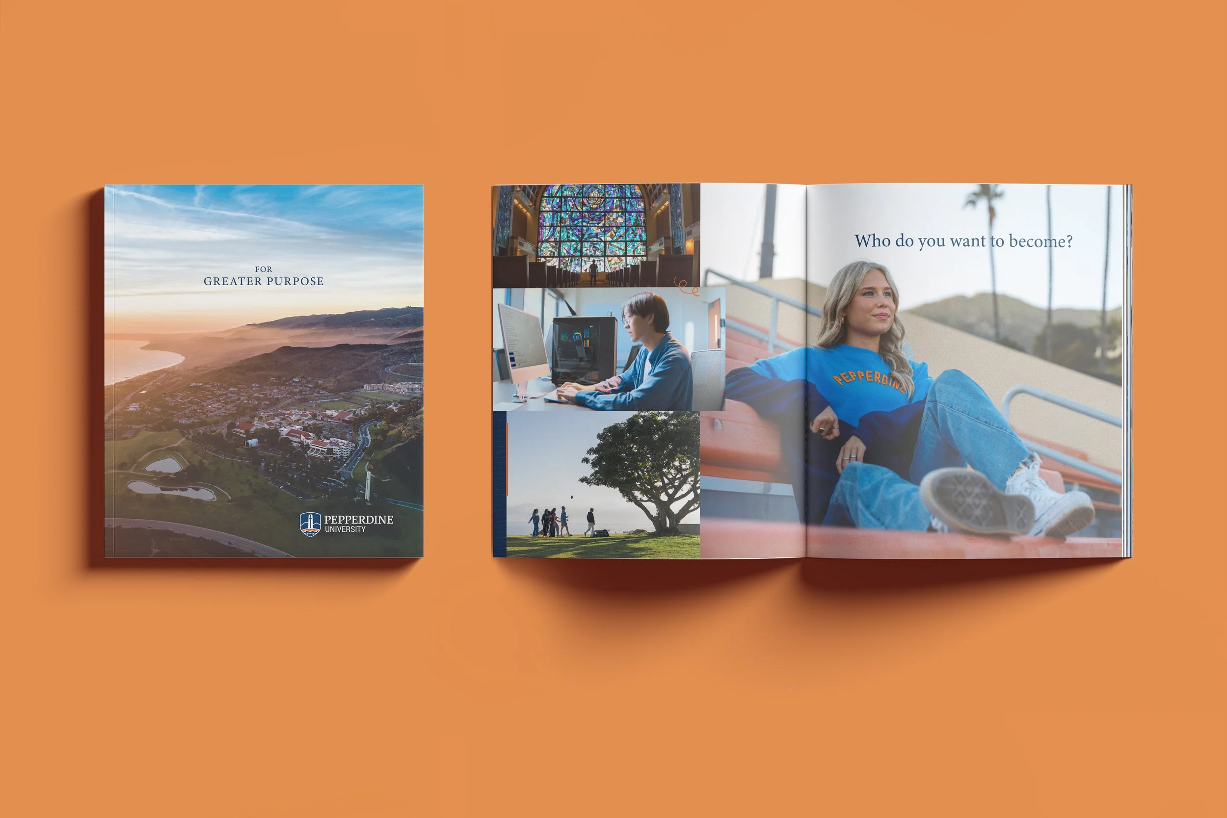
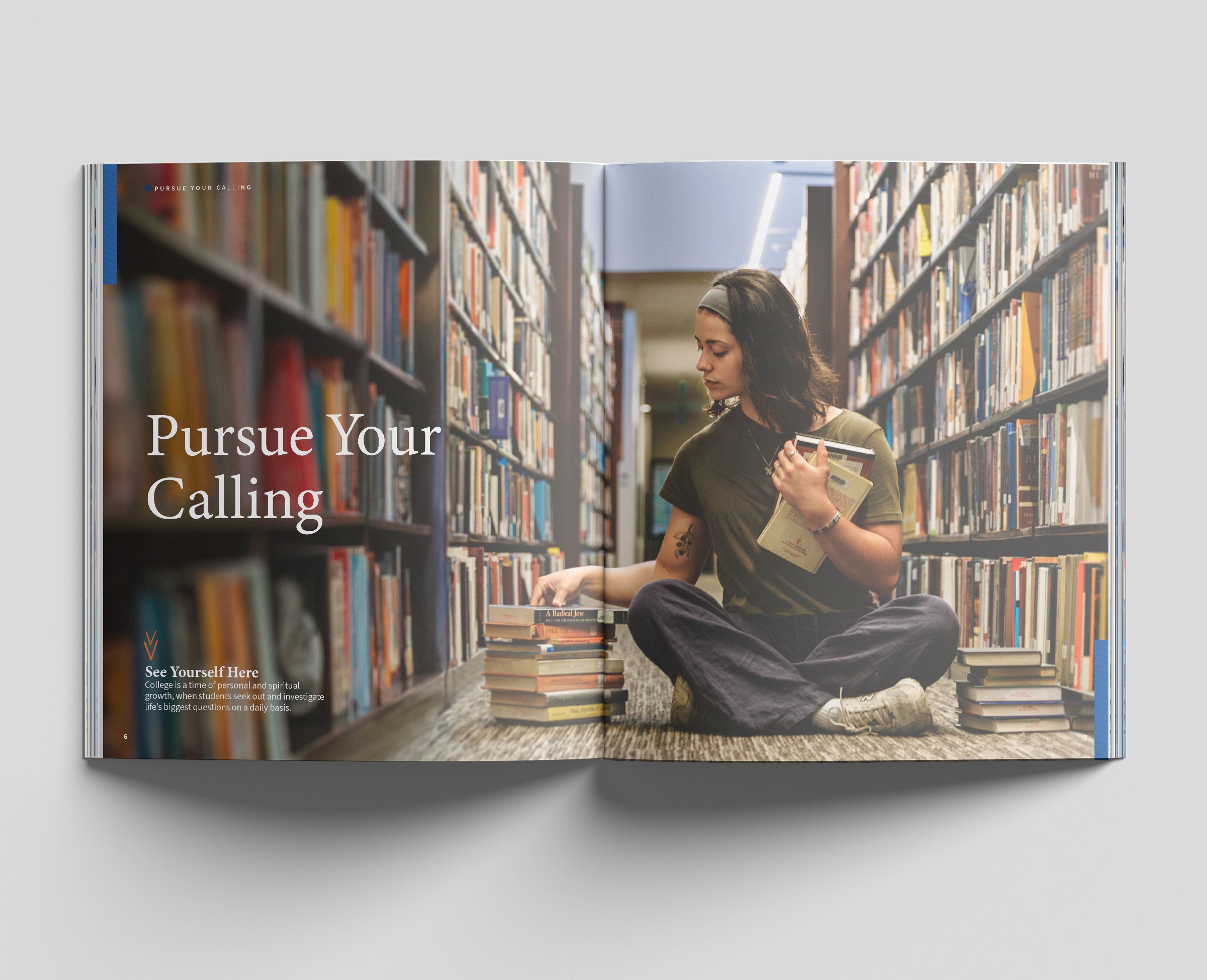
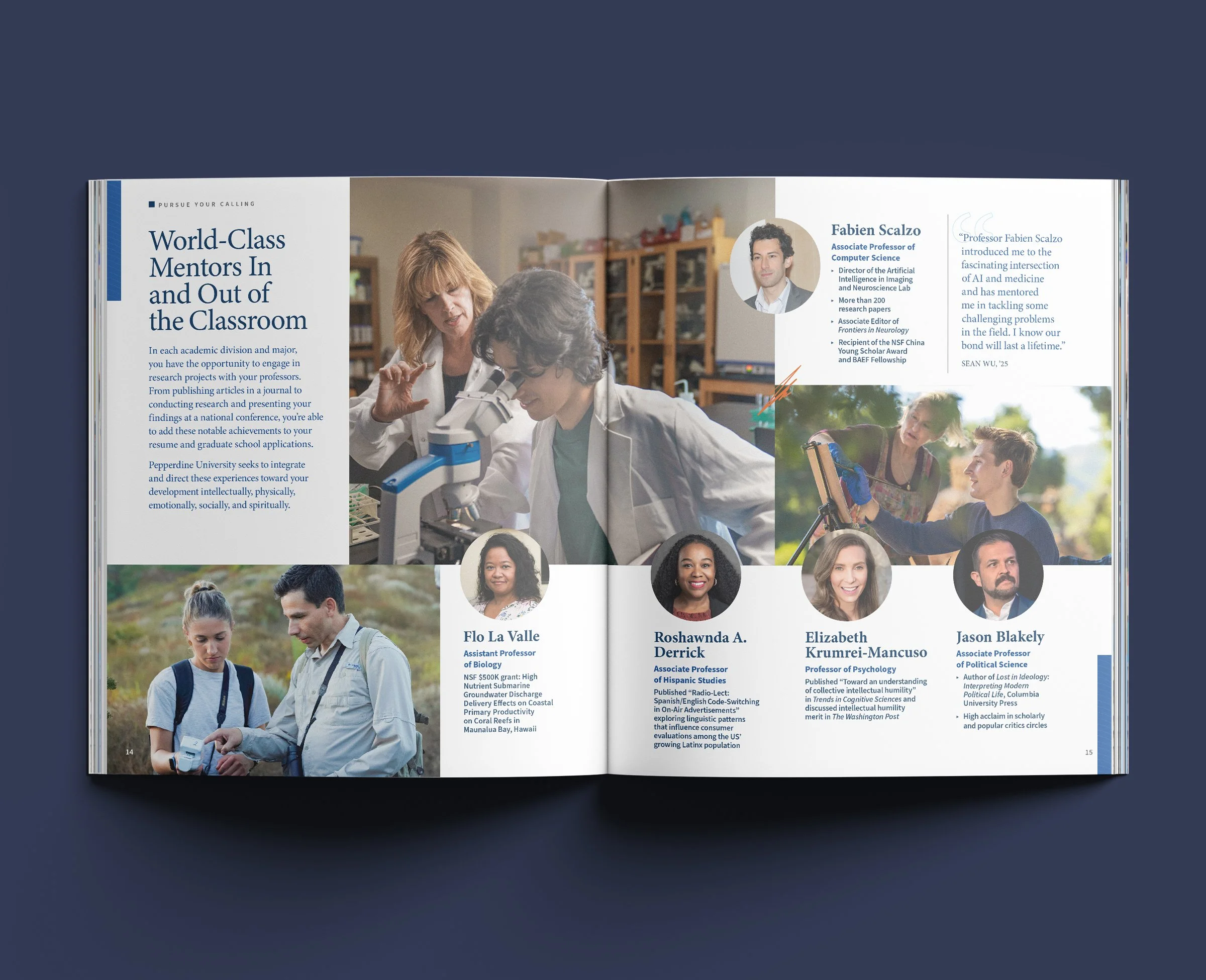
I worked in parallel with the media producers on the strategic redesign of the 2025-2026 Seaver viewbook, the first flagship touchpoint and testing ground for the new brand launch and visual elements. The viewbook provided ample opportunity to observe and address any potential failures or needs within the brand system. I met regularly with the client’s design leaders and the web development team to discuss how various elements in the viewbook would perform across other touchpoints and clarify any additional template needs.
-
The final viewbook design and features provided a launch pad for me to develop and build out the remaining design templates for the final campaign deliverables (ads, social media, web, OOH, and slides). I provided the templates as examples in the brand guide and wrote detailed instructions for applying the new design.
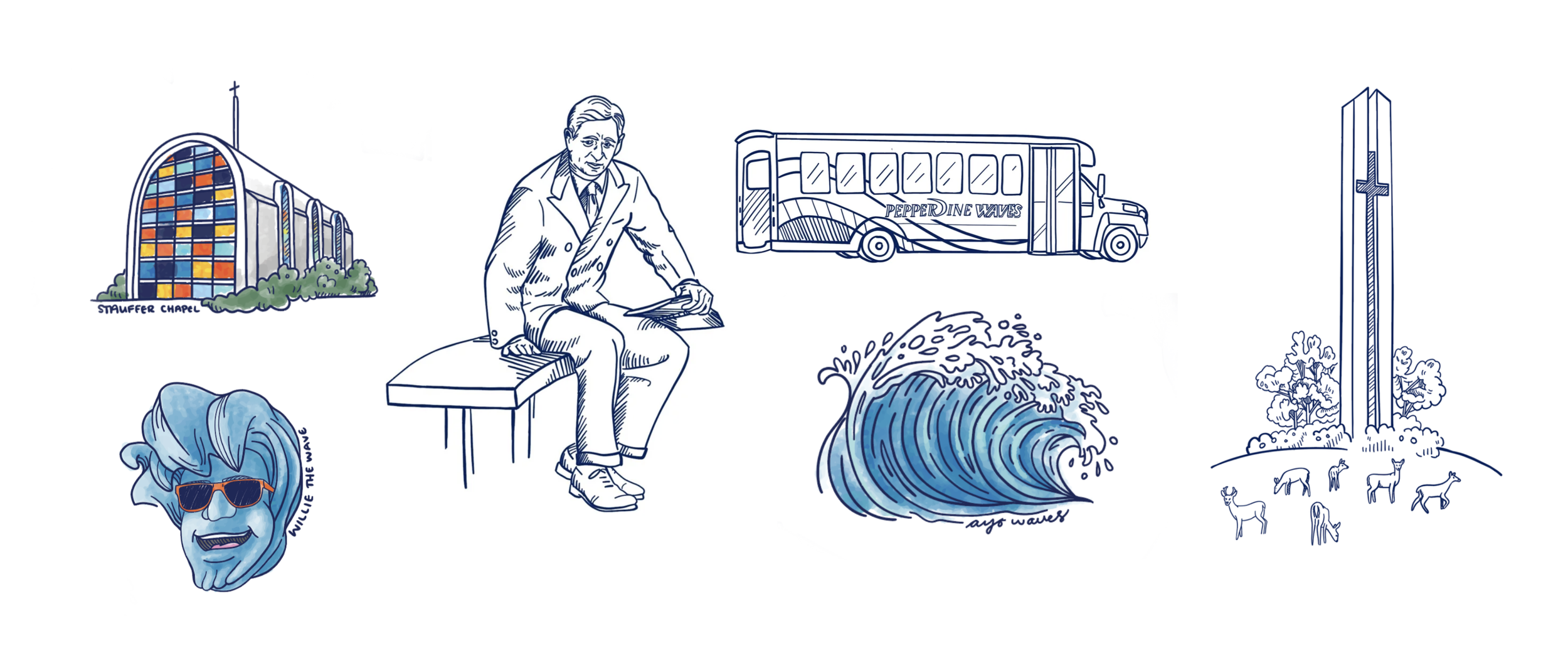
Found inspiration and early compositions